Ever completed a paint-by-numbers kit and felt something was missing? You filled every section, matched every color, yet the final result still looked… flat. That is not just your perception; it is how these kits are built. The pre-printed canvas forces sharp lines that block natural transitions. Each color zone is isolated, breaking up the flow that gives real art its depth. That mechanical finish leaves no room for emotion, and the painting ends up feeling like a checklist, not a creation. This is where most people get stuck. The piece is done, but it lacks realism and creates a clear visual disconnect. But here is the thing: the kit is only the base. What you choose to do next is what turns it into something that belongs on your wall. With the right approach, even a structured paint-by-numbers canvas can be transformed into something expressive and truly yours.
Preparing the Canvas for a Natural Finish
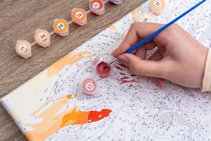
Ever tried brushing over a Numbers Painting Canvas and felt the resistance? Like the brush is fighting back? That happens when the canvas is raw and thirsty. If you want smoother results, it starts before the first stroke. Here is what to do:
- Apply a thin gesso layer
This primer fills in the weave and creates a soft, even surface for your paint. Without it, color absorbs too fast or skips altogether. - Let it dry completely
Rushing this step only leads to peeling or cracking when you start painting. - Use a wide, flat brush for coverage
It helps spread the gesso evenly and avoids streaks that ruin the flow. - Lightly sand after drying (optional)
If the surface still feels rough, a quick sanding with fine-grit paper makes it studio-smooth. - Wipe off any dust before painting
Sounds basic, but dust ruins adhesion and gives you a blotchy base.
By taking time for this surface prep, you turn a budget canvas into something that feels right. It sets you up for better color blending, less frustration, and a much more natural finish. Do not let your paint-by-numbers piece fall short just because the canvas was not ready. This part matters more than you think.
How to Blend Colors Without Losing the Guide?
Ever stare at two color zones and think, these shades are fighting each other? That’s because most paint-by-number kits are not designed to blend. They are made to block. But if you want to make it look like art, not a patchwork, you need to blend the boundaries without losing the map. Here is how you do it:
- Use the wet-on-wet technique
Work fast, apply the second color before the first dries. This helps the two merge without hard edges. - Feather the brush at the color edges
Do not press. Light, flicking strokes help create soft transitions without smudging outside the guide. - Tap in mid-tones
Mix a little of each color and use that in between to make the shift feel natural. - Reduce sharp edges with a damp brush
Clean the brush, dampen it slightly, and sweep over the line where two colors meet. - Work in small sections
You will have more control and less panic about drying time.
The trick is to balance color merging that still respects the original zone layout. You are not painting blindly. You are softening reality into the design. This is where flat art becomes fluid, where hard borders turn into believable shadows. Done right, your paint-by-numbers piece will hold its structure but flow like a hand-blended canvas. You are not erasing the guide; you are making it invisible.
Fixing the Numbers & Borders That Ruin the Illusion
Nothing kills the magic faster than finishing a paint-by-numbers piece… and still seeing numbers peeking through. You step back, admire the colors, then bam, there it is, a ghostly “17” staring right at you from the sky. It feels unfinished. Cheap. Disconnected. This is where most projects fall apart visually. Here is how to stop that from happening:
- Use a thicker first layer on lighter zones
Lighter paints need more pigment to improve opacity. Do not water them down. - Go for a double coat, especially on numbers
Let the first dry completely, then reapply only where needed. That keeps your layer control clean. - Dab white acrylic on stubborn outlines before painting
This helps hide printed numbers that keep showing through even after two coats. - Work in natural light
It helps you spot areas that need full coverage.
The secret? You do not need to bury the whole canvas in paint; you just need to target the problem zones. Most paint-by-numbers kits come with low-opacity tones in some areas, and skipping this step leaves your piece looking unfinished. With a few extra strokes and a little patience, you keep the structure, but kill the print. That is how real art hides its scaffolding.
Customizing the Color Palette for Life-Like Results
Ever stared at a sunset in your paint-by-numbers kit and thought, Why does it look like neon orange next to traffic cone red? Yeah… that’s the problem with factory-mixed paints. They are bold, sure, but not believable. Most kits are designed to stand out, not to blend in with reality. If you want something that feels natural, you have got to tweak the colors a little. Here is how to tone down that artificial pop:
- Desaturate harsh tones with white or a neutral mix
It dulls that plastic finish and gives you muted tones that look closer to nature. - Warm or cool shades, depending on the subject
Add a touch of blue to tone down yellows, or a bit of red to warm up greens. This keeps color harmony in check. - Fix unnatural tones by blending small test batches first
Use a scrap corner of the canvas to test it before applying. - Use color mix tips from artists or references
Look at real images of the scene you are painting. Nature rarely uses pure color blocks. - Tone down the contrast between adjacent zones
If the jump between two areas feels too harsh, mix a midtone between them to soften the visual break.
Most custom paint by numbers kits give you a starting point, not a final formula. Do not let the numbers intimidate you. This is your painting, and slight color edits go a long way in building something that feels grounded. By adjusting tones and embracing color mix tips, you eliminate that showroom gloss and inject subtlety. Your paint-by-numbers project starts to breathe because it finally speaks your visual language.
Adding Highlights and Depth Beyond the Kit
Have you ever looked at your paint-by-numbers piece and felt like it’s… just lying there? No spark. No movement. Everything looks okay, but it does not pop. That is because kits give you color, but not light. And light? That is what gives a painting depth, energy, and life. You have to add it yourself.
Idea | Think of lighting like storytelling. Where you put a highlight changes the whole mood.
Here is how to fake real light and add believable dimension:
- Map out a light source angle before painting
Decide where the light is hitting from. Top left? Bottom right? This helps guide your shadows and highlights. - Use soft white or a lightened base color to build highlights
Apply it sparingly on raised areas, foreheads, edges of objects, tips of leaves. This is your highlight placement zone. - Create realistic shadows with desaturated versions of the base color
Do not use pure black it kills the tone. Instead, go for muted blues, purples, or a darker tone of the same hue. - Blend gently into base colors to avoid harsh edges
Use a dry brush to soften borders so that light fades naturally into mid-tones.
These 3D paint tricks do not rewrite the original guide—they elevate it. With some depth layering, you turn a printed image into something that reacts to space. Your paint-by-numbers piece will finally start looking sculpted instead of stamped. That is the difference between a filled-in kit… and something you want to frame.
Detail Work | Where to Refine and Where to Leave Alone?
You are halfway through your paint-by-numbers project, and suddenly, you want to fix everything. A jagged edge here. A blurry stroke there. But here is the truth: not everything needs correcting. Overworking a painting can flatten it just as much as ignoring the details. Here is how to sharpen your piece without killing its character:
- Focus on the focal point
Eyes, faces, or center subjects, that’s where brush control matters most. This is where you apply full stroke precision. - Enhance key elements only
Not every flower petal needs micro-detailing. Choose a few to refine and leave the rest suggestive. That creates contrast. - Use smaller brushes only when needed
Going too fine on every section can ruin the flow and slow down the entire process. - Skip over-detailing background zones
Let the viewer’s eye rest. This also helps you control focus better.
In most paint-by-numbers kits, the urge to “fix” everything is strong. But smart restraint is just as artistic as heavy edits. By knowing where to refine and where to walk away, your final piece will look intentional, layered, and clean without screaming I tried too hard. Not every stroke needs to be perfect… just placed with purpose.
Using Tools Beyond the Kit Brush
Let us be honest. The tiny brush that comes with your paint-by-numbers kit? It gets the job done, but barely. Stiff bristles, one generic size, and zero flexibility. If you want a painting that looks layered and alive, you have to bring in backup. Here are a few tool upgrades that change the game:
- Fine liner brushes | For sharp lines, facial details, or eye edges—precision makes a difference.
- Blending sponges | Ideal for soft transitions in skies, backgrounds, or subtle gradients.
- Angle-tip brushes | Great for corner work and smooth blending at the edges of shapes.
- Synthetic round brushes | More control, smoother finish, and less brush drag.
These tools give you realistic applications, especially when you are trying to blend or refine details. Most paint-by-numbers kits are limited only by the tool, not the artist. And once you feel the difference in pressure, stroke control, and flow, you will never go back to just one brush. Better tools do not replace skill; they unlock it.
Varnishing Techniques for a Professional Finish
You just finished your paint-by-numbers masterpiece after hours of effort, colors blending perfectly… but now what? Without a proper top layer, all that work is exposed. Dust, humidity, and fading start chipping away at your result. That is where varnish comes in. It is not just protection, it is the final stroke that says, this is done. To seal the paint like a pro, here is what you need:
- Gloss varnish | Adds a light-catching shine, great for bright or high-contrast areas.
- Matte sealer | Tones down reflection and adds a soft, smooth texture.
- Spray vs brush-on | Sprays are faster, but brush-on gives you better control and fewer missed spots.
- Apply in thin, even layers | Never go heavy. Let each coat dry completely.
This final coat tip changes how your paint-by-numbers piece feels and lasts. It makes colors look deeper, the texture more even, and the whole artwork feel cohesive. If you want to protect your art, give it that last layer of care. Without it, your paint-by-numbers might fade faster than you think. With it, it holds up for years, and looks the part too.
Final Display Tips | Frame It Like Real Art
You poured time, effort, and focus into your paint-by-numbers piece, so why leave it looking unfinished on the wall? Hanging it without a frame is like wearing a tux with slippers. It just does not hit the same. Display matters, and a few simple tweaks can make it feel like real gallery work. Here is how to showcase it right:
- Use a float frame | It gives your art breathing room and adds depth.
- Go for a gallery mount | This lifts the canvas off the wall and gives it presence.
- Mind the wall positioning | Hang it at eye level, with proper light, preferably where natural highlights hit the surface.
Want to make it look original? Consider custom framing that complements your color palette. No flashy edges, just clean lines that let the art speak. The way you display paint by numbers can make the difference between “nice try” and “wow, where did you get that?” The kit may be mass-produced, but the finish should feel one-of-a-kind.