Bright patterns look fun on Pinterest, but in real life they can feel scary. “What if the room turns into a circus?” is a common thought. People often try colorful peel and stick wallpaper when they want to bring bold shades into the house without painting every surface. If you choose the right spot, vivid prints make the whole home feel more lively, not chaotic.
Simple rules before you start
Before you buy a roll full of flowers, stripes or abstract shapes, take a slow walk around your place. Look at the light, the size of each room and the furniture you already own. You don’t need to cover all four walls in every space. Sometimes one bright corner works better than a full makeover.
It helps to keep a few basic rules in mind:
- Put stronger patterns where you spend time during the day, not in dark storage corners.
- Let vivid walls face more neutral ones, so the eye can rest.
- Keep big furniture simpler if the wall has many colors.
- Use similar tones in cushions, art or rugs to tie the space together.
If you worry that a print might be “too much”, start with a smaller area: a niche, a wall behind a shelf or a part of the hallway. You can always add more later.
Living room and dining area
The main room in the house often handles rich designs better than any other space. There is more light, more space and usually more plain surfaces like large sofas and big rugs. Here a bright wall can set the mood for the whole home.
Good spots in the living zone:
- Behind the sofa to create a clear focal point.
- Around the TV area so the screen doesn’t float on a plain background.
- In the dining corner to separate it from the rest of an open-plan room.
- Behind open shelving to make books and decor look more interesting.
Keep at least one large item calm: for example, if the wall bursts with color, choose a simple sofa in grey, beige or off-white. Add a couple of cushions or a throw that repeat one or two shades from the print, and the room will look “put together”, not noisy.
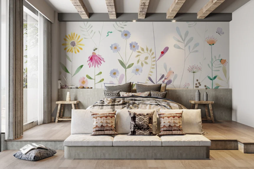
Bedrooms and kids’ rooms
In sleeping spaces you still want peace, even if you love color. Rich patterns fit best on the wall you see less when you fall asleep, usually behind the headboard. A bright panel there creates a cozy backdrop but doesn’t shout at you from every angle.
Soft geometric motifs, small florals and watercolor effects work well in adult bedrooms. For children, you can allow more play: rainbows, jungle animals, stars or abstract shapes. Just try to keep at least one wall light and simple, so toys and posters don’t compete with the print.
If you like boho style with tassels, woven lamps and layered textiles, look at bohemian peel and stick wallpaper. These designs often mix warm earth tones, hand-drawn lines and relaxed motifs. They look great behind the bed or in a reading corner with a rattan chair and a floor lamp.
Hallways, entries and small corners
Colorful designs shine in small “in-between” spaces that usually feel boring. A tiny entry looks more friendly with a bright wall behind a shoe rack and a mirror. A long, narrow corridor feels less like a tunnel when one end has a strong print that pulls you forward.
You can also:
- Cover the inside of a niche or open closet for a fun surprise.
- Add pattern to the wall by the stairs so the climb feels less dull.
- Dress up the space behind a home office desk in the corner of a room.
- Use bold sheets inside glass-door cabinets to frame dishes or glassware.
These projects don’t require many rolls, so they stay budget-friendly. They also let you enjoy intense color in small doses, which many people find easier to live with.
Kitchens and bathrooms
In kitchens, bright coverings work best away from direct water and grease. Use them on a dining wall, around a breakfast nook, or on the surface opposite the cooking zone. Pair strong patterns with simple cabinet fronts and plain countertops.
In bathrooms you need to watch moisture. In well-ventilated rooms, peel-and-stick products can work on dry walls away from the shower. Think about the area behind the sink, the top half of the wall above tiles, or the space behind open shelves with towels and bottles. Always follow the manufacturer’s advice for humid spaces.
When colorful wallpaper is not the best idea
There are cases when it makes sense to slow down. Very tiny rooms with almost no daylight can feel cramped with heavy prints on every wall. Homes already full of many colors in furniture and decor may also look messy if you add a very busy pattern. In these situations, pick smaller areas or gentler mixes of shades.
The main point: vivid designs don’t have to turn your home into a carnival. If you place them in the right spots and balance them with simpler pieces, they bring energy, personality and joy. You get a space that feels like you, not just a copy of a showroom — and that is exactly what a home should be.